Webflow modal and popover elements: rebuild pop-ups natively
Webflow added native modal and popover elements in November 2026. How a Webflow modal differs from a popover, how to rebuild old interaction pop-ups, CSS for the backdrop, and fixes for common problems.
Webflow now has native modal and popover elements, released in November 2026, and they are the better way to build pop-ups, sign-up prompts, menus and tooltips on a Webflow site.
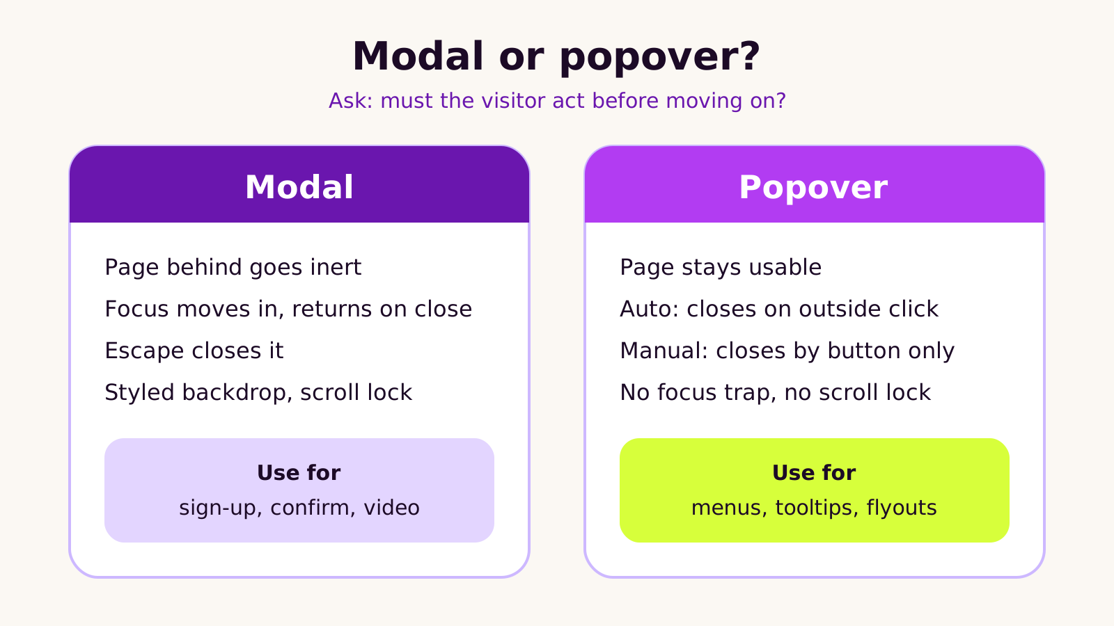
A modal is for something the visitor must deal with before carrying on, like a sign-up form or a confirmation. The browser makes the page behind it inactive, moves focus into it, closes it with the Escape key and returns focus to the button afterwards. A popover is for things that float over a page that stays usable, like a menu or a tooltip.
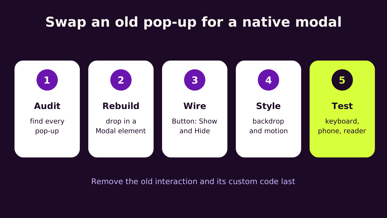
To move an older pop-up across, list every pop-up on the site, rebuild each one with the new element, open and close it from a button using the Show and Hide actions, style the backdrop, then test with a keyboard, a phone and a screen reader. Remove the old interaction and its custom code last.
Watch for old scroll-lock scripts fighting the new settings, hover triggers that aren't supported, and modals used where a popover would do.
If your site has a lot of older pop-ups, an experienced Webflow team can plan the rebuild with you.
If your Webflow site has a newsletter pop-up, a "book a demo" form that opens over the page, a mega menu or a few tooltips, this post is for you. In November 2026 Webflow added native Webflow modal and popover elements, and they change how we'd build all of those. You'll learn what each element does, when to use which, how to rebuild an older pop-up safely, and how to fix the problems teams hit in the first week.
The problem with pop-ups built the old way
Until now, most Webflow pop-ups were a div set to display: none, shown and hidden with an Interaction. That looks fine with a mouse. It falls apart in the places nobody checks during design review.
- Keyboard users press Tab and land on links behind the pop-up.
- Escape does nothing, so people get stuck or reload the page.
- Screen readers keep reading the page underneath as if nothing opened.
- On phones, the page scrolls behind the overlay, and the fixes for that usually mean another block of custom code.
Each pop-up also tends to collect its own small script: one to lock scrolling, one to close on outside click, one to stop a video when it closes. After a couple of redesigns, nobody remembers which script belongs to which pop-up. That is the maintenance problem the new elements address.
How Webflow modals and popovers actually work
The important detail is that these aren't Webflow-specific widgets. They sit on features browsers already provide, which is why they behave better than anything we could build from Interactions alone.
Modals use the browser's dialog behavior
Webflow's launch notes describe modals as native dialog elements opened as modals. When one opens, the browser does four things for you: it makes the rest of the page inert (it can't be clicked, focused or read by assistive tech), it moves focus into the modal, it closes the modal when the visitor presses Escape, and it returns focus to the button that opened it. You also get a backdrop layer you can style in the Style panel, and scroll lock is available as a modal setting.
Popovers use the Popover API
A popover floats on top of the page when a visitor clicks a button, but the page stays usable. Webflow's help center says published popovers open and close without Webflow's JavaScript unless you animate them with Interactions. There are two closing modes:
- Auto: closes when the visitor clicks outside it or presses Escape, and opening another auto popover closes the first. Good for menus and dropdowns.
- Manual: closes only through a Hide or Toggle button. Good for something like a cookie preferences panel that shouldn't vanish on a stray click.
Popovers don't trap focus and don't lock scrolling, by design. If you find yourself wanting either, you probably want a modal.
| Use case | Element | Why |
|---|---|---|
| Newsletter or demo sign-up form | Modal | The visitor should finish or dismiss it first |
| "Are you sure?" confirmation | Modal | A decision is needed before moving on |
| Video lightbox | Modal | Focus and scroll should stay with the video |
| Navigation dropdown or mega menu | Popover (auto) | Visitors may click elsewhere at any moment |
| Tooltip or "what's this?" note | Popover (auto) | Small, optional, easy to dismiss |
| Persistent filter or settings panel | Popover (manual) | Shouldn't close on an accidental click |
How to rebuild a Webflow pop-up as a native modal
Here is the order we follow when moving an existing site across. Don't delete the old pop-up until the new one is tested.
-
1
Audit. In the Navigator, search for classes like "modal", "popup" or "overlay", and check Interactions for click triggers that show hidden elements. Note any custom code in Site settings or page settings that mentions
overflow,bodyor a pop-up class. - 2 Rebuild. Add a Modal element from the Add panel (or a Popover for menus and tooltips) and move the content in: the heading, the form, the close button. Keep the same form and its field names so your form notifications and any CRM integration keep working.
- 3 Wire the button. Select the button that should open it, go to its Link settings, choose the Modal type, pick your modal and set the action to Show. Inside the modal, give the close button the Hide action. Modals don't offer a Toggle action, so you need both buttons.
- 4 Style. Style the backdrop in the Style panel and turn on scroll lock in the modal's settings. Check the modal at every breakpoint; long forms need a max height and their own scrolling on small screens.
- 5 Test, then clean up. Test with a keyboard only, on a real phone, and with a screen reader. Once it passes, remove the old div, its Interaction and any scroll-lock script that belonged to it.
Optional: animate the modal with CSS, not Interactions
If you animate a popover with Interactions, Webflow's JavaScript comes back into play. For a simple fade and slide, we'd rather use CSS. Paste this into an Embed element or the site's head code, and replace signup-modal with the class on your modal:
<style>
.signup-modal {
  opacity: 0;
  transform: translateY(16px);
  transition: opacity .2s ease, transform .2s ease,
              overlay .2s allow-discrete, display .2s allow-discrete;
}
.signup-modal[open] {
  opacity: 1;
  transform: none;
}
@starting-style {
  .signup-modal[open] { opacity: 0; transform: translateY(16px); }
}
.signup-modal::backdrop {
  background: rgb(28 10 38 / .6);
}
@media (prefers-reduced-motion: reduce) {
  .signup-modal { transition: none; }
}
</style>
The @starting-style rule gives the opening animation a starting point, and allow-discrete lets the closing animation finish before the element is hidden. Browsers that don't support those features simply show and hide the modal without animation, which is a fine fallback. Check it in the published site, not just the Designer.
What we've learned building with them
The elements are simple; the mistakes are mostly about choosing the wrong one or leaving old code behind.
- Don't make everything a modal. A menu built as a modal blocks the whole page every time someone opens it. That feels heavy, and it's not what visitors expect from navigation.
- Be careful with pop-ups that open on page load. Google's search guidance has long discouraged intrusive interstitials that cover content on mobile. We'd open sign-up modals from a clear button, or after a visitor has scrolled through some content, rather than the moment the page appears.
- Give every modal a visible close button. Escape works, but many visitors on touch screens never use a keyboard.
- Name things clearly. Name each modal after its job ("Demo request modal"), so the next editor finds it in the Navigator and in the button's Link settings.
- Treat accessibility as a check, not a promise. Native elements handle focus and inertness well, but your content still needs a heading, labeled fields and enough contrast. If you have legal accessibility obligations, check with a qualified adviser.
Troubleshooting
Symptom: the page still scrolls behind the modal on phones. Likely cause: scroll lock isn't on, or an old script that sets overflow on the body is fighting the new setting. Fix: turn on scroll lock in the modal's settings and remove the old script from Site settings and page settings.
Symptom: Tab still reaches links behind the pop-up and Escape does nothing. Likely cause: the button is still opening the old div through an Interaction. Fix: check the button's Link settings use the Modal type with the Show action, and remove the old click trigger.
Symptom: you can't find a Toggle action for a modal. Likely cause: modals only support Show and Hide. Fix: use Show on the opening button and Hide on a close button inside the modal.
Symptom: a dropdown should open on hover but only opens on click. Likely cause: hover triggers aren't native to popovers. Fix: accept click to open, which also works on touch screens, or keep the existing Dropdown element for that menu.
Symptom: the closing animation doesn't play in one browser. Likely cause: that browser doesn't yet support animating the close of a dialog. Fix: nothing is broken; the modal still closes correctly. Keep the animation short so the difference is minor.
Questions people ask
Do Webflow modals and popovers need a paid plan?
Webflow's help center lists popovers as available on all site plans. Check the Add panel in your Designer, as new elements can reach accounts at different times during a rollout.
Will native modals slow my site down?
They usually do the opposite. Because the browser handles opening, closing and focus, you can often remove scripts that older pop-ups needed. Animating them with Interactions adds Webflow's JavaScript back, so we'd use CSS for simple motion.
Should I replace every old pop-up right away?
Start with the ones that hold forms or other conversion steps, since those matter most to keyboard and screen reader users. Decorative tooltips can wait for the next round of site updates.
Why this matters for your business
Pop-ups are often where leads are captured: the demo form, the newsletter offer, the quote request. If those are hard to close, impossible to reach by keyboard or broken on phones, people leave. Rebuilding them as native elements makes them easier to use, simpler to maintain and less likely to break when someone edits the site later. It's a good moment to review which pop-ups you actually need.
If you're weighing whether Webflow is right for your marketing site, our guide to choosing between Webflow and WordPress for a B2B website covers editing and ownership, and our post on the recent Webflow site plan changes for agency-built sites explains what to check on billing. For the design side, our UI and web design service can help you decide which prompts deserve a place on the page.
Quick checklist: list every pop-up, pick modal or popover for each, rebuild with Show and Hide buttons, style the backdrop, turn on scroll lock, test with keyboard, phone and screen reader, then delete the old interaction and its code.
If you'd like help rebuilding your pop-ups, our Webflow development team is happy to take a look.
(over to you)
Planning a build like this?
Tell us what you're building and we'll come back with ideas and next steps.